Showing posts with label Symmetry. Show all posts

Monday, November 26, 2012

Visual Review 10: Beyoncé "Countdown"

Leave a Comment

This video sees the "Run The World (Girls)" singer paying homage to different movies, musicals and icons of the 1950s through the 1990s. Directed by Adria Petty, Knowles shows off her baby bump while dancing around in colorful leotards to this upbeat love anthem. Most of the effects in this video were applied after the music video was shot. The video has faced controversy for ripping off choreographer, Anne Teresa De Keersmaeker, and some of her pieces.

The video opens with a close shot of Knowles as she begins to sing the song. Her hair and makeup are reminiscent of English model, Twiggy. A lot of the effects used play with the coloring and the lighting seen throughout the video. The next shot is a full body-shot of Knowles moving her arms like a clock. The clip here appears to have been sped up. We have simple black and white lines falling into and out of the frame that serves as a background image. The black and white is also reflected in her outfit she is seen in. The video then splits into multiple frames as Beyoncé begins to countdown in her song. The video cuts between mid-shots and fast moving, slim frames showing her full figure. Then we are shown the black loafers and white socks (referencing Michael Jackson) and the dance moves are similar to that of Audrey Hepburn in the film, FunnyFace.

A lot of the post-shooting effects added are cuts of Beyoncé in bright colored bathing suits. She also wears a black and white hat and these shots are set against a colored background that constantly changes. In this mid-close ups Knowles showcases her baby bump. This frame then splits in two, again. Then we are taken to an audition space--the entire video is shot in a New York warehouse--where we are shown wide shots of Knowles and her dancers referencing the 1980's movie, Fame. We also see symmetrical shots where there are two frames created showing the same image, and as she turns and as the dancers move, we see two bodies moving towards the center.

One of the next scenes is a extreme wide shot of 10 different versions of Beyoncé dancing to the countdown in the loft space. While researching for the video, MTV Newsroom stated that this shot is "the key scene where [she] puts all her aforementioned sides into perspective" (MTV). Throughout the video we stick with this mod, black and white color scheme seen through the background, clothing and space of the loft. Then we are thrown splashes of vibrant colors reminiscent of the 60s. Among the many references in this music video, we have yet another when the video cuts to shots of Knowles in a men's dress shirt with her hair tied up with a scarf: Bridget Bardot. These shots contrast well with the soft colors used in the background and from the dress shirts. These wide shots are split and fall out of the scene to take us back to the wide warehouse audition space. Channeling Diana Ross from Dreamgirls (more post-shooting effects with the double frame meshed to look there are two Beyoncé's. This shot is also split into three frames where we have lines moving in the background, again staying with the black and white color scheme), snap choreography reminiscent of West Side Story, and finally more wide shots of dancing around the loft space with the off the shoulder top taking us back to Flashdance. Fast moving frames and close-ups of the singer are basically the entirety of the video.

There are rarely any actual camera moves except for the ending--it's hard to tell if when she's sitting in the chair if the camera is doing a dolly-out or if it's more of a zoom-out. The camera is pretty static throughout. This music video relies on the visuals, movement and looks of the singer to really pull it off. I think despite the controversy that it was a success.

Read More...

Tuesday, October 16, 2012

7th Original Photo: Symmetry (At the table)

Leave a Comment
Symmetry
I decided to take this photo while I was at work, again. There are plenty of photo opportunities at a consignment shop. It was actually harder to find a symmetric set up than I thought it would be. I was looking for shapes and we don't get too many of the same items. So I thought this dining set would be a great example. Each of the chairs are positioned opposite each other so that their identical.
Read More...

Monday, October 15, 2012

Video Scavenger Hunt

Leave a Comment

Fellow Group 2 Members: Lindsey McCabe & Lauren Ramon
Read More...

Tuesday, October 9, 2012

Visual Review 5: Nikka Costa "Like a Feather"

Leave a Comment

Nikka Costa is an American singer-songwriter who fuses funk, soul and blues into her music. Costa’s “Like a Feather” single first premiered in 2000 in a Tommy Hilfiger ad, which jump-started the singer’s career. Her debut U.S. album Everybody Got Their Something was released in 2001.

The video begins with a wide shot of what appears to be a stage or studio. This video has one setting for the entire duration. The background is a digital screen that will project geometric designs along with Nikka’s name throughout the video. We have medium close up shots of the singer as she begins singing the song. We have contrast with the red designs on the screen and her blue ensemble that also contrasts against her red hair. 

The shots then are split into four multiple frames all showing the same thing. It’s almost reminiscent of the “Brady Bunch” opening sequence. Identical frames are stacked to create four small blocks. These blocks are also divided into two half’s where the left side shows a wide shot of Nikka and the right side shows a mid-close up of her on the microphone.

We have some low angles, not extreme. And consistent throughout is the mirror-like effect where the shot becomes symmetric. Two Nikka’s are shown on the screen side by side dancing. We have cuts back and forth between symmetric shots and the four stacked frames with wide shots and then medium close ups. Then we’re shown the same frame stacked on top of one another creating this stack of blocks large on the outside and that are smaller towards the center. 

There are more symmetric wide shots with the screen split in half, cutting to Nikka’s mid-section. Wide shots are combined with the stacked frames and become smaller wide shots that show her full frame. I liked how various shots are lit and then others are in the dark. For most of the video, the light fills the entire set but for certain sections of the song, the light is only coming from the digital screen in the background.

There is a quick extreme close up of Costa’s mouth through a lens in the shape of a circle—it’s not fish eye. The effect with four stacked blocks evolve from showing the same shot to playing one simultaneously after the other in rhythm with the music. The camera editing cuts back and forth between the mid close ups and then to three thin frames of Nikka. Profile shots and medium close ups show again her singing at the microphone. We have a few high angle shots while the lights are out and the stage is only lit by the screen and an EWS from a high angle. 

After the first verse it’s pretty repetitive—which I don’t think is a bad thing. We have continuous shots switching from multiple frames to wide frames. There are no dolly-ins or even panning which I found to be interesting. The camera stays in one position throughout. I think that works fine because with Nikka’s moving and the flashing going on in the background it would have been too much. The video has that geometric shape/seventies design going on where the patterns are shots of Costa singing which I thought was cool and brings out the red and blue colors well. Effective use of light and shadow towards the end where again the only light source is from the digital screen but you can see Costa’s silhouette and those blue and red colors look nice against one another. Towards the end there are some extreme low angles towards the bottom giving off the effect that the camera is flat on the ground. 

I personally love the effects put on the video. It adds to the fun nature of the song and really enhances the beats and sounds that are heard throughout. The dancing/movement are synchronized perfectly with the flashing images and I think the creative team did a good job choosing colors and the setting. I couldn't imagine this video shot on location in a street somewhere. The video compliments the song perfectly.
Read More...

Tuesday, September 4, 2012

Class 1 Assignment

Leave a Comment
10 images representing 10 different words.

Power
I chose this picture because its something that I believe represents power and because this wouldn't be the first thing people associate with the word. Yoga is very soothing and healthy for the body but it takes a lot of inner strength, power to be able to move your body a certain way.

Photo By: Josh Maready


Repulsive
 The title of this photo is Attractive Repulsive and that's why I chose this. It's not too pleasant to look at and if someone saw this woman walking down the street people would probably stay at a distance or avert their eyes, yet at the same time this photo is very capturing.

Photo via Hannah German


Saturation

I chose this photo because I like the use of de-saturating the image so that the colors blend, and it has a "beach-like" look. 

Photographer Unkown via Tumblr

Shape
 I chose this picture because when hearing the word shape, my mind instantly thought of a form or figure of some kind. These lights are geometric and take form; shape.

Photographer Unkown via Commute Home  
Isolation
I chose this photo because to this empty hallway and this single chair represent loneliness, which I'd associate with Isolation. The chair is isolated from the rest.

Photo By: Wyetha Lipford via Flickr


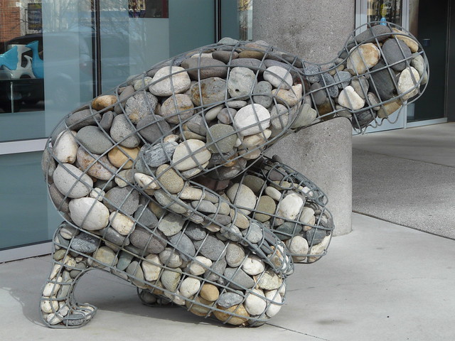
Hard
I chose this photo not only because of the fact that the statue is made of rocks and stones which has a hard texture, but also because the position of the stone man reminds me of someone having a hard time, and the hardships people get bent up over.

Photo By :~Yuna~ via Flickr 


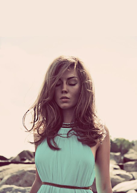
Soft
 I chose this photo because I like how the soft blue colors blend together. And also the softening effect on the picture, not to mention that ruffle dress is probably pretty soft.

Photographer Unknown via Alfreda Prey 


Symmetry
 I chose this photo because lots of architecture--like this one--are made up of exactly the same parts on each side or either face each other. 

Photographer Unknown via Tumblr


Texture
I chose this photo because the seeds from the strawberries are very vibrant in the photo and have this grainy appearance that I can almost feel by looking at it. 


Photo By: Wyetha Lipford via Flickr

Contrast
 I chose this photo because the patterns on the chair and from the wallpaper are different and the colors stand out well against one another.

Photo By: Michael Partenio
Read More...