Showing posts with label Photography. Show all posts

Tuesday, December 4, 2012

Diversity Project

1 comment
For the diversity assignment, I decided to introduce my partner Henna to the world of theater, but probably not exactly what she would expect. Yes, it's all fun and games when it comes to cast bonding, theater games and putting on the production but a lot goes on behind that. The director of the new show I'm in, WECYCLING, Caleen Jennings offered to give Henna a speech coaching session. We met in Caleen's office and discovered that both Caleen and Henna were fans of J.K. Rowling. We printed a section from Harry Potter and the Sorcerer's Stone and Henna read through it while Caleen gave her tips. Henna appeared nervous at first but really improved her speech technique as she warmed up to it. I think she enjoyed her lesson--well I hope she did. I also think Henna walked away with tips for any future presentations she may encounter. For the Caribbean Circle event I attended with Henna, check out her blog


Read More...

Tuesday, November 13, 2012

Self Portrait

3 comments

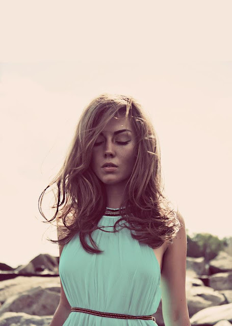
I decided to take this photo because I'm always facing towards the camera and always smiling so I wanted to do the opposite for this portrait. I used curve adjustments did a cross process (RGB) which really enhanced the colors in the photo, making the green and red very rich giving it a nice contrast. I then used a tilt shift blur which allowed me to pick center spot--wherever I wanted that to be--and distort and twist everything around that point which remains clear while everything else shifts/blurs.


A lot of my most personal objects that represent me are in my room. I have this collage (and two others) I started making my freshmen year at my previous school. The collage is made up of old class assignments, letters, photos, pamphlets from events that I attended, written jokes and cut out calendar dates. All of this marks some of my best memories. I also cut out a picture I took in NY of a marquee (on Broadway) at the theater where my favorite musical used to play. The show happened to be ending on my birthday so I thought that would be a perfect final touch of my collage of me.

For this, I turned the saturation way up to really enhance the color in the photo, then I slid the hue to this purple/pink-ish color so that the entire photo would have this tint. I then used a filter to diffuse the picture. The other effect used was a movie camera lens flare to reflect off of the picture within the picture.


I wanted this photo to represent the budding actress in me. Here I have what I believe to be my most important roles I've played so far. The main photograph is a photo I took of a show I directed (Agatha Christie's And Then There Were None). The Capulet was taken from a picture of me wearing my Capulet T shirt from a role I played in Romeo & Juliet--I just cropped out the letters and pasted them onto the main photo. To the left is another one of my characters from The Fiddler on The Roof and towards the front is my greatest accomplishment thus far--AU's Glengarry Glen Ross. 

I used a color balance to cool the picture by adding more of a blue tint to it. I liquified some of the faces of my cast by distorting their height, shifting their bodies around, bloating and puckering their faces. I also made the adjustment for the Glengarry photo to make it B&W, then I used the color balance again to match it with the background photo.
Read More...

Tuesday, November 6, 2012

10th Original Photo: Repulsive (Litter)

Leave a Comment
Repulsive
It may seem weird or even gross to you. But if you had to clean out the litter box of two cats who share the same box for 7+ years, you'd be repulsed by it. Cause I definitely am.
Read More...

Tuesday, October 30, 2012

9th Original Photo: Hard (Rocks)

Leave a Comment
Hard
This photo--not taken recently-- was taken in Old Town, Alexandria at the water front. Hard reminds me of a surface or texture that is hard. This rocks looked pretty harsh against the water so I thought this would be perfect.
Read More...

Tuesday, October 23, 2012

8th Original Photo: (Home Decor) Shape

Leave a Comment
Shape
I took this photo because there are lots of shapes in the little knickknacks that my mom bought for around the home. This object--I'm not really sure what it is--has a curvy shape. Like a vase, but that's not its purpose. Almost like a lamp of some kind. I took the word shape literally to mean a figure.
Read More...

Tuesday, October 16, 2012

7th Original Photo: Symmetry (At the table)

Leave a Comment
Symmetry
I decided to take this photo while I was at work, again. There are plenty of photo opportunities at a consignment shop. It was actually harder to find a symmetric set up than I thought it would be. I was looking for shapes and we don't get too many of the same items. So I thought this dining set would be a great example. Each of the chairs are positioned opposite each other so that their identical.
Read More...

Monday, October 8, 2012

6th Original Photo: (Clothing) Contrast

Leave a Comment
Contrast
I decided to take this photo while I was at work. I work at a consignment shop so there always new and exciting things to be found there. As I was looking around I saw the blue scarf and knew instantly I wanted to show contrast of something against it. We have loads of costume jewelry so I thought something red would look great and stand out against the scarf. 
Read More...

Tuesday, October 2, 2012

5th Original Photo: Saturation

Leave a Comment
Saturation
I actually discovered this photo opportunity while shooting my scavenger hunt assignment. These flowers were in the right position and gave off a bright color. I used photo editing software to saturate the color and enhance the yellow in the flower.
Read More...

Tuesday, September 25, 2012

4th Original Photo: Isolation (Lonely Car)

Leave a Comment
Isolation
I decided to take this photo because I knew I wanted to use objects around my home. I intended on focusing on the little VW's and then putting one of them "out of the circle" to emphasize loneliness. I forgot I had an old Barbie VW and thought that would be even better. Again, I associate the word Isolation with lonely.
Read More...

Monday, September 24, 2012

Visual Review 3: "Rear Window"

Leave a Comment

Via imdb
     Rear Window, released in 1954 and directed by the “Master of Suspense” Alfred Hitchcock was produced by Paramount studios starring James Stewart, Grace Kelly and Thelma Ritter. Shot in Technicolor which was restored to what we would have seen when the film was shot. The colors were helpful in making the film come to life. This movie was one of Paramount’s biggest sets.

     Rear Window was seen as Hitchcock’s seen as one his most mature pieces, the fact that it’s all shot in studio did not hinder any of the camera shots vs. it being on location. This is Hitchcock’s way of showing objects and association in what’s going on – in the beginning of the film and all throughout we get close ups of objects to relate to the moods and time of day  (i.e., the thermometer with heat and close-up of watch with early AM view).

     There are dolly-ins to the different apartments, and camera panning both left and right to show the entire complex. Many of the intimate shots between Kelly and Stewart have a shallow depth of field where you have the background apartments out of focus. As Stewart’s character Jeffries looks thorough the binoculars you begin to see his point of view which is constant throughout the film. When Jeffries suspects the Salesman (Thorwald) of murdering his wife he decides he needs a closer point of view and brings out the telephoto lens. This lens allows for details and becomes and important aspect of the film to Jeffries finding out that Thorwald has committed the crime. The camera tilts up and down to hint a secret spot (flower bed), that viewers don’t realize until the end of the film. 

     Stewart has three roles throughout the film, (1) the wandering male character of Jeffries, (2) the camera man as he pans with his own telephoto lens to watch and (3) the director – he has a complete view on the “house of fiction” via his Rear Window.  It’s Hitchcock’s own story with Jeffries in the director’s chair (his wheelchair). With the constant panning throughout the movie, the telephoto lens that Jeffries holds has the slightest shake to it as he watches Thorwald move from room to room.  We are shown shots within shots from the viewfinder as Jeffries gets closer to solving the mystery (i.e. figuring out the clue to the flower bed). And at the climax of the film, fast motion is used to show neighbors coming from their homes as Jeffries dangles from his window. 


     Unlike the short story the flower bed holds the secret to a piece of the murder unlike the cement wall. There is no Sam who brings food or runs around for him.  In the movie Jeffries is aided by his girlfriend Lisa and his nurse, Stella.  LB Jeffries lives in the apartment, while in the short story he resided in a house. The characters were adapted for thematic purposes. The newlyweds that went out every night have become the newlyweds that stay in. And Miss Lonleyhearts is no longer the widow who lives with her daughter. The only constant characters are L.B. Jeffries--who in the story was named Hal Jeffries, also restricted to movement--and his doppelganger, Thorwald with the sick wife. Hitchcock’s films fill the void in showing us vs. describing what could have happened while characters are asleep (i.e. “Wife” is shown leaving in AM). 
Stewart’s view is restricted like the story because he can’t completely see what’s going on; like a dollhouse with the rear wall cut out.  Before Jeffries suspects his neighbor of murder, as an audience we see the guilt in Thorwald first, because he’s looking all around to make sure no one is watching him.  Thorwald’s constant guilt-watch in the story isn’t noticed right away. Jeff is a little slower to pick up what’s going on…or rather he’s not that involved, he reassures himself with reasoning as to why no one was checking in on the wife (“delayed action). In the film, Jeffries just knows right away that something isn’t right and becomes fixated on the salesman while occasionally checking back in on the other characters in the “doll house”. There is a scene in the story where the movements between Thorwald in his apartment and the landlord showing the two tenants the space above him are in synch (only to reveal later where the body of Mrs. Thorwald is). There is a moment of synchronization between floors in the film as well however they are between Lisa (Grace Kelly) and Miss Lonelyheart as they both realize the man with the piano has stopped playing his music. This was done using a wide camera lens, making a greater picture than if it were a zoom in (because you wouldn’t be able to see both women).     
     Light symbolizes life and you saw that in everyone’s apartment. The lights were always on and they were carrying on with the everyday business. Thorwald’s apartment was always dark. The lights were always off which you associate with an evil character. The only sign of him being present was the constant lighting of the matches in the dark. Shadows are used re-create natural light from the sun. They are also used to hide both the good characters from being seen as well as the murder. Shadows are also played with through the drawn shades, and as an audience you are left to wonder.
     The obvious difference in the film and story’s ending was that instead of Jeff becoming free and getting his cast taken off, Jeffries breaks his other leg and is further entrapped—so to speak--in his relationship with Lisa (Kelly).

     Rear Window is a great film, one of my favorites by Hitchock. All in all, it doesn't even compare to the short story. The movie really brings every element that you'd need camera-shot wise and for acting skills that it comes together beautifully.
Read More...

Wednesday, September 19, 2012

Visual Review 2: Bruce Davidson

Leave a Comment

To view the full series from Subway, visit Magnum Photo Gallery
Subway
Bruce Davidson, 1980
Bruce Davidson + Guardian Angels, 1980
Bruce Davidson, 1980
Bruce Davidson is considered one of America’s most influential documentary photographers. His career began at the age of 10, when his mother built him a dark room. He studied at the Rochester Institute of Technology and the Yale University School of Design. After living in New York for twenty-three years, Davidson began his startling color essay of suburban life in Subway which was shot in 1980.

Bruce Davidson’s Subway chronicles inhabitants of the New York City subway system. According to Davidson, this series examines “the people in the subway, their flesh juxtaposed against the graffiti, the penetrating effect of the strobe light itself, and even the hollow darkness of the tunnels.” The work “inspired an aesthetic that goes unnoticed by passengers who are trapped underground, hiding behind masks, and closed off from each other” (Via Aperture)


This entire series is just fantastic to me. There are a lot of extreme colors captured through the clothes that the passengers are wearing and from the graffiti sprayed everywhere. Davidson’s use of shadows help to focus on the subjects in each shot. There are only a few shots that aren’t shown underground. These show people on the train platforms and are skylines of the city with the train tracks in view--they are still both in the dark, with looming shadows, but you catch glimpses of the sunlight in the photos reflecting onto the subjects and scenes which combine to make beautiful shots, like the photo of the woman wearing sunglasses.

There are several close-ups of hands holding onto the railing and passengers pressed very close on one another, so as a viewer you get the feeling of cramped spacing during a commute. He managed to capture a culture and a whole new dangerous world that many were unaware of. He showed various viewpoints and focal lengths with every photo capturing stillness while also capturing wide-shots of subjects and motion-blur with the train movement.

There were a few high and low angles but I feel as if to really get into the hustle and bustle public transit, it worked better to just stay in level with everything else that was going on. You can see he experimented with different ways to capture people and used the sunlight (which appears to be the only light in some shots) to cast shadows onto his subjects to keep the underground/tunnel effect. The graffitti provides the perfect backdrop for some of the subjects, creating nice juxtaposition. What I also noticed that while the photos were dark and left a lot in the shadows, that didn’t change the mood of the pictures and I think that’s because of the bright colors stood out.

I think this series of photos was more importantly to make light of the dangers of the NYC subway and Davidson's reason of casting shadows and letting the darkness consume these photos were to establish the reality of the city and to showcase what these people living in the city actually see on a daily basis. I thought these pictures were phenomenal and were a great series.

Sources: TIME, Magnum Photos, Aperture

Read More...

Tuesday, September 11, 2012

Photo Essay: "She..."

Leave a Comment
"She turned her cant's into cans and her dreams into plans" 
Quote By: Kobi Yamada

This quote is in reference to my mom and her artwork. She managed to take a big step and go back to college for a degree in photography, along the way learning and developing drawing skills she never knew she had. I chose to showcase her photos and artwork around the home in our attempt to make our bland walls a bit colorful. The Mad Men poster adaptation wasn't a class assignment but it's a project she did on her own and the last photo being a work in progress. I wanted to capture the detail in each photo while showing the woman behind the work and how this little wall will eventually be covered with artwork. Unfortunately, for most of the photos I had to use indoor lighting from our floor lamps. I used a Kit Lens (18-55 mm), with a macro extender allowing me to show more detail in some of the various projects. 


Read More...

Tuesday, September 4, 2012

1st Original Photo: Soft (Kitty)

1 comment
"Soft kitty, warm kitty, little ball of fur. Happy kitty, sleepy kitty, purr, purr, purr." (Big Bang Reference)

Photo of my eldest cat, Maximus
Soft
I took this picture because when I thought of the word soft, the first thing I thought of were my two cats.
Read More...

Class 1 Assignment

Leave a Comment
10 images representing 10 different words.

Power
I chose this picture because its something that I believe represents power and because this wouldn't be the first thing people associate with the word. Yoga is very soothing and healthy for the body but it takes a lot of inner strength, power to be able to move your body a certain way.

Photo By: Josh Maready


Repulsive
 The title of this photo is Attractive Repulsive and that's why I chose this. It's not too pleasant to look at and if someone saw this woman walking down the street people would probably stay at a distance or avert their eyes, yet at the same time this photo is very capturing.

Photo via Hannah German


Saturation

I chose this photo because I like the use of de-saturating the image so that the colors blend, and it has a "beach-like" look. 

Photographer Unkown via Tumblr

Shape
 I chose this picture because when hearing the word shape, my mind instantly thought of a form or figure of some kind. These lights are geometric and take form; shape.

Photographer Unkown via Commute Home  
Isolation
I chose this photo because to this empty hallway and this single chair represent loneliness, which I'd associate with Isolation. The chair is isolated from the rest.

Photo By: Wyetha Lipford via Flickr


Hard
I chose this photo not only because of the fact that the statue is made of rocks and stones which has a hard texture, but also because the position of the stone man reminds me of someone having a hard time, and the hardships people get bent up over.

Photo By :~Yuna~ via Flickr 


Soft
 I chose this photo because I like how the soft blue colors blend together. And also the softening effect on the picture, not to mention that ruffle dress is probably pretty soft.

Photographer Unknown via Alfreda Prey 


Symmetry
 I chose this photo because lots of architecture--like this one--are made up of exactly the same parts on each side or either face each other. 

Photographer Unknown via Tumblr


Texture
I chose this photo because the seeds from the strawberries are very vibrant in the photo and have this grainy appearance that I can almost feel by looking at it. 


Photo By: Wyetha Lipford via Flickr

Contrast
 I chose this photo because the patterns on the chair and from the wallpaper are different and the colors stand out well against one another.

Photo By: Michael Partenio
Read More...